Sunday, March 24, 2024

Archie Comics - Key Issues & Controversial Covers

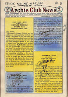
There are a handful of covers published over the years that have become famous for innuendo or highly suggestive text (the most famous being Betty and Me #16 where Archie said he had to "beat off" three other guys). 

First of all, even though these are often reference as having a "Controversial Cover," I must wonder if that is the correct label for these. Perhaps "Innuendo Cover" would be better.?

Here's a few of the KEY COMICS:


Archie #271 (June 1978)
Major Key: Controversial "Pearl Necklace" Cover
Even a low-grade copy of this book goes for $50-$70, and high grades go for more.
This is probably the second-most infamous cover from Archie comics (the first being the above-mentioned Betty and Me #16).
Link: https://www.comics.org/issue/105852/


Archie #511 (Aug 2001)
Major Key" Controversial "In the pink" cover
Probably the 3rd most-famous innuendo cover.
Link: https://www.comics.org/issue/238442/


Archie Comics #48 (Jan-Feb 1951)
Minor Key: Controversial Cover
"Betty do you wanna spoon?"
Link: https://www.comics.org/issue/8645/


Archie Comics #55 (March-April 1952)
Minor Key: Controversial Cover
Mr. Lodge asks an innuendo question: "Did Archie get there yet?"
Link: https://www.comics.org/issue/105636/


Archie Comics #78 (Jan-Feb 1956)
Minor Key: Controversial Cover
Archie is talking to betty and says he wants to "feel the clutch."
Not as famous as the others, but it still gets higher prices than surrounding issues.
Link: https://www.comics.org/issue/105659/


Archie... Archie Andrews Where Are You? Comics Digest Magazine #111 (Sept 1997)
Minor Key: Controversial Cover
Betty tells Archie to "Watch out for a big hole around here."
Link: https://www.comics.org/issue/293921/


Betty #8 (Sept1993)
Major Key: Famous Bikini Cover
Not as famous as some of the other covers, but this one brings a premium price in the hundreds of dollars.
Link: https://www.comics.org/issue/213444/


Betty and Me #37 (Sept 1971)
Minor Key: Controversial Cover
Betty says, "Yes, Archie -- You're rubbing me the right way."
Link: https://www.comics.org/issue/221897/


Betty and Me #40 (Feb 1971)
Major Key: Controversial Story
In this issue, Archie and Betty fall in a lake and are forced to rent a cabin together; they are soaking wet so Archie orders Betty to "Take your clothes off!" They spend the night innocently wrapped in towels, but their parents are naturally furious. FAMOUS story and has only been reprinted once.
Link: https://www.comics.org/issue/221900/


Betty and Me #136 (Nov 1983)
Minor Key: Controversial Cover
Has some notoriety because Betty is in her underwear standing on scale. Some readers were ticked off because it was body shaming her, others thought it was risque for showing her in her underwear on the cover.
Link: https://www.comics.org/issue/221996/


Everything's Archie #22 (Oct 1972)
Minor Key: Controversial Cover
Joke about "swinging."
Link: https://www.comics.org/issue/221897/


There are more, but I'll submit them at another time.

Monday, August 28, 2023

Graveyard Shift 01

 I've started work on adapting a short story into comic format. The exercise is really just so I can take a stab at doing something that I have not written myself. I also think it would be fun to go back and do some public domain horror stories and try to nail down the style of the old Warren Magazines like EERIE, CREEPY or VAMPIRELLA.

I am starting with a short story titled "Graveyard Shift" by Rex Munsee. He's a member of the Snicker Snack Amateur Press Association (APA), which is a type of fanzine. Rex wrote the story a few issues ago, I read it and decided it would be fun to adapt it. So I wrote to him and he agreed to let me do his story, and the results will be printed in Snicker Snack and the Collectors' Club Newsletter.

The story has simple modeling and set requirements, which is a major criteria for my selection process:

  • Few character designs (there are 4)
  • Limited locations / sets:
    • Exterior:
      • Country road a night with a small car driving on it
      • Country road leads to a nice house in the woods
      • Front of the house as she enters
    • Interior:
      • Living room
      • Bedroom
      • Possibly another part of the house, like a hallway or kitchen area
    • Props (key items):
      • Hospital-type bed
      • Hypodermic & medical equipment
      • Set dressings (pictures, furniture, etc.)
      • Video camera
      • Video monitor
      • Antique mirror
If you're familiar with my workflow, then you know I start out in Poser (a 3D app) and then render line art which is composited and cleaned up in Clip Studio Paint. This makes the first step is to collect the 3D assets I need, and fortunately I already had most of the items above. The exterior of the country road has proved to be the most problematic because I didn't have exactly the sort of hilly environment I imagined when I started to block out the story and make thumbnails.

As for the character design, we'll cover that next time!

Other Posts in this Series

  • Graveyard Shift 01 - Project Overview (you are here)
  • Graveyard Shift 02 - Character Design Lauren Normal
  • Graveyard Shift 02 - Character Design Lauren Transformed
  • Graveyard Shift 03 - Character Design Victor
  • Graveyard Shift 04 - Character Design Vincent
  • Graveyard Shift 05 - Exterior Night

Friday, January 20, 2023

Retro Coloring 06: Skin Color

As noted previously, coloring comics was a two-step process performed by two different people.. The colorist indicated which colors should be used, but the separator did the actual, physical task of stripping the color separations. This is why there were often errors in the colors printed in old comics; either the colorist made an error, or (more likely) the person doing the separations made an error do to being in a hurry or simple inexperience.

Experience is also something that mattered, a lot. There was a lot of repetition in coloring comics, and as such both colorist and separator tended to skip over common things that were done over and over again. This becomes apparent when looking at old color guides: One thing that is often skipped is the code for Caucasian skin tones. This was a very standard code so the colorist really didn't need to specify it since the separators already knew what it was.

That's all good and fine, except for poor ole me living in the 21 Century! 

I actually had a little trouble confirming that these are the standard skin tones used by Marvel, DC, Archie and Harvey. Okay, it wasn't like I had to delve into books of forgotten lore, but it did take a few days to find and confirm through multiple sources that these are, in fact, the correct codes for standard skin tones from the 1940s - 80s:

  • White People: Y2R2
  • Conan's Skin (redder skin): Y3R3
  • Black People: YR3B2
  • Hulk's Green Skin: YB2

Tuesday, December 13, 2022

Retro Coloring 05: Champions #4

 Anyone who knows me is aware that I have a big soft spot in my heart for Archie comics, so it shouldn't be a surprise that the first color guides I bought were for Archie Comics. I think I have 6 so far, and 5 of those are for Archie titles – some old and two from the late 1990s, and those use the "expanded color palette" that has more variations of the CMY colors, and brings in screens of black, as well. At some point in the future I'll talk more about those colors, but for now I'm going to stick to the classic look of 64-colors (if you don't know what I'm talking about, go back to part one of this series, or read the article in Marvel Age #13: "How to Color Comics the Marvel Way").

Editorial Input on Color Guides

But back to Archie. I love the company's work and I find their simple color guides as a PERFECT starting point for my own efforts (you'll see my own that in an upcoming article when I actually use new digital tools to attempt recreating the original colors of an Archie comic from the 1960s). But, the colors are simple.

Superhero and horror comics had much more sophisticated coloring, and therefore more editorial input. As I said last time, superhero comic color guides are more expensive, typically running about $50 - $100 per page (that's not to say you can't find a few bargains out there, but they are more infrequent). A little hunting got me an interesting find: an 8-page back-up story in the Marvel Comic, The Champions #4 (March 1976), colored by Janice Cohen for about $83.

Unlike the Archie color guides I have shared with you, this color guide is on standard 8.5 x 11 inch letter size copies, which provides a nice big work area for notes and guidance. Unfortunately, I'm not sure who wrote them: Writer, Artist, Editor? If I ever find out I'll update this article.

Take a look at the editorial comments for a behind-the-scenes look at the production of this story (incidentally, I have not yet obtained this comic so I cannot provide you with a scan of it in its printed form; I'll also update that when I can).

Color Guide for Champions #4 (March 1976)


On this page, notice now her skin tones are marked as Y4R3B3.
The use of the number 4 is very surprising because that is part of the "expanded" color palette that (even without adding black (as I'll discuss in a future article) more than doubles the color options from 64 to 125. As noted in the previous article, the letter/number combo represents a specific dot intensity (i.e., fill percentage). In this formula, 4=70%, making her skin tone:


Y4Yellow70%
R3Red [magenta]50%
B3Blue [cyan]50%
This will print as:

The normal skin tone for a black character would be: YR3B2. I'm going to go into this a lot more next time, as I dive into the very important (and illusive) topic of Skin Color.

But on this page (and others) her skin tone is crossed out with pencil marks.
Also, take a look at how someone wrote "OK" on the bed color and blue background in the last panel.


Story and art © 1976 Marvel Comics Group

NOTE: This color guide is presented for the scholarly purpose of discussing how comics were colored in the past. Its fair-use inclusion here recognizes that the underlying story and artwork are the copyrighted property of Marvel Comics.

Next up: Retro Coloring 06: Skin Color

Tuesday, December 6, 2022

Retro Coloring 04: Reggie and Me #25 Color Guide, pt 2

Here's another story from Reggie and Me #25 (Aug 1967). I picked up these 8 pages (2 non-story, and missing the first page) for about $80. Like the other story, this 

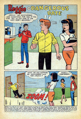
I don't have the complete guide for this next story, so I'm including the first page as it was printed, which includes a coloring mistake that is rather revealing! Look at Ronnie's blouse in the first panel and note that incredible crop top she's sporting! There's no way that was kosher at school in 1967! And, as you can see in panel 2, her modesty (and The Bee's dress code) is restored!

Credits:

  • Script: Frank Doyle
  • Pencils: Harry Lucey
  • Inks: Marty Epp
  • Colors: (attributed to) Barry Grossman
  • Letters: Bill Yoshida


On the following pages, I've placed the guide on the left and the published page on the right. I wanted to show you the editorial changes that were made after Barry Grossman submitted his work. Note on page one how the editor indicated that the lower-right box should be red, not yellow. This is the sort of thing that turns up quite a bit in the next color guide I'm going to share with you.


Want to read the whole printed comic?
Check it out here: https://viewcomics.me/reggie-and-me-1966/issue-25


NOTE: This color guide is presented for the scholarly purpose of discussing how comics were colored in the past. Its fair-use inclusion here recognizes that the underlying story and artwork are the copyrighted property of Archie Comics.

Next up: Retro Coloring 05: Champions #4

Tuesday, November 29, 2022

Retro Coloring 03: Reggie and Me #25 Color Guide, pt 1

 Color guides are a type of original art created in the production of comic books. They are one-of-a-kind creations with hand work by the Colorist. To be honest, they're not very collectable, at least not when compared to the original art. But that's also part of their charm. For instance, the 6 pages I'm presenting here only cost about $88. Not bad for something created about 54 years ago!

However, I have seen some color guides go for very high figures, especially for covers. If you decide to look into it, you should expect to pay about $50 a page for most comics, more for mainstream superheroes like Superman and Batman. Honestly, you could see $200+ a page for those, and if it's a famous story, multiply that by whatever the seller wants. I recently saw the cover color guide for Amethyst, Princess of Gem World #1 listed at $1,999.

Reggie and Me #25, 

I think Archie is a great place to start with color guides. The colors are simple, straightforward and do not include a lot of special instructions. So, without further ado, here it is. (Note, the copies are on what feels like regular paper; it's kind of thin and definitely shows a little "bubbling" from the application of wet dyes (and you can see the ink stains on the third page. There is an odd, brownish border to the pages, which are about the size of the printed book.)

Credits:

  • Script: Frank Doyle
  • Pencils: Al Hartley
  • Inks: Jon D'Agostino
  • Colors: (attributed to) Barry Grossman
  • Letters: Jon D'Agostino


© 1967 Archie Comics

NOTE: This color guide is presented for the scholarly purpose of discussing how comics were colored in the past. Its fair-use inclusion here recognizes that the underlying story and artwork are the copyrighted property of Archie Comics.

By the way, if you have sharp eyes, you'll notice that page 26 is missing. That page was an ad, so it's not part of the story. Want to read the whole printed comic? Check it out here: https://viewcomics.me/reggie-and-me-1966/issue-25


Next up: Retro Coloring 04: Reggie and Me #25 Color Guide, pt 2

Tuesday, November 22, 2022

Retro Coloring 02: Color Guides

When talking about coloring comics, it's easy to forget something that was once very obvious: Coloring comics was a two-step process performed by two different people:
  1. The Colorist decided what colors went where. This person's job was to start with a stat (later photocopy) of the black & white artwork and then, using special dyes, paint the desired colors where they go. Afterwards, the colorist would hand write color codes on the art. (For more info on this, read last week's blog and don't forget to read "How to Color Comics the Marvel Way" from Marvel Age #13: https://viewcomics.me/marvel-age/issue-13/22.) The finished Color Guide was then handed off to the next person...
  2. The Separator took the Color Guide and then used a variety of physical tools and media (mostly acetate (thin plastic sheets) and cutting and pasting them where they go based on the color formulas provided by the colorist. This was a physical job that was often done by women (at least by the 1960s) and the accuracy with which the separator followed the colorist's guidance was kind of hit-or-miss. By that, I mean that the better comic shops got (and paid for) separators who did at least a workman-level job. They usually got it right, but sometimes (especially on tight deadlines), you'd see color get missed or messed up. But the cheap shops had a lot of problems.

I'm trying to track down some good videos on the physical part of color separations. If I find any, I'll link to them. This one is a good discussion about modern recoloring, and it has a few pics of the separation process: https://www.youtube.com/watch?v=uNYDiJibRM4.

Color separation is now handled digitally with computers (unless you're working with some old-school print-making equipment). So we're not going to focus on that aspect of the process. Instead, we're going to look at some Color Guides.

Color Guides

As I said, a Color Guide starts off as a black & white copy of the black line art. The colorist then paints in each color with special dyes (again, that Marvel Age article covers all that jazz) and then makes up the page with the associated codes that relate to the chart published in last week's entry.

Here's what a simple color guide looks like:

Reggie and Me #25 (Aug 1967)

The colors in this guide are attributed to Barry Grossman (by that, I mean most Archie scholars agree that is probably who colored this; it looks like his work and that was his job at the time).

Here's a scan of the printed page so you can compare the two:


Want to read the whole printed comic? Check it out here: