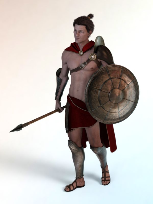
I think Leo 7 was a surprise to many customers. He's a brand new shape, with no Genesis 2 predecessor (though comparisons can be made to Scott 6; and frankly, I can get behind it, if we are going to see a profusion of male shapes in the Genesis 3 line, similar to what we are getting in the female line). The initial presentation of Leo in the store, as a Spartan warrior with more than a passing resemblance to Gerard Butler as King Leonidas (his shape and facial features are reminiscent, but far from close enough to be called more than an homage) is impressive. He's not quite the everyman we saw with Michael 7: taller, bulkier while still having an overall trim physique and with a face that is... dramatic and unique.
The forum response to Leo was lackluster, and I think the surprise factor added to, at times, negative reception. People were expecting an analogue for Teen Jayden or Gianni, and when they were surprised with this new shape (which I like initially and have come to truly enjoy), their expectations were dashed. Yes, going against expectations can cut the wrong way sometimes. Its too bad really, because Leo is impressive, as are his accoutrements.
One of the loudest complaints I heard, both in the forums and on Facebook was that Leo looked "just like Michael" and I even heard that he looked like Eddie (the name for the base Genesis 3 Male). I don't understand that. Not at all.
.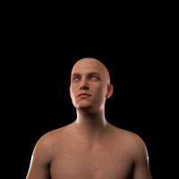
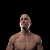
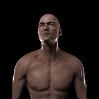 On the right here you can see Leo, then Mike, then Eddie. Do they look alike? Or even remotely similar? I certainly don't think so. I'm not going to go into a litany of the differences I see. And its not my intent to ridicule or belittle anyone who actually feels like they look similar; I just don't see it.
The second largest complaint that I witnessed was a lack of texture options. Well, there's some weight to that argument. Leo comes with a single eye color: green. But if you count Eddie's brown, blue and grey (which are, of course, free) there's an additional three. Michael 7 had four different eye colors: blue, brown, green... and amber (?). So... okay, maybe that's a little slim.
Leo also has no "extra hair options": no scalp hair (neither does Michael, and frankly... do any of those actually look good?), no facial hair (neither does Michael, though he did come with two brow colors which was nice and I would have liked to see a second brow; and, like the scalp textures, do many of the painted on beards look good?) and no body hair (neither does Michael). So, in comparison... Michael had 3 more eye textures and a, rare, second brow texture. That's the extent of the differences. Does this require a vehement repudiation of the package? I don't think so.
And when you look at the textures that Leo DOES come with, the lack of extras complaint pales a bit. Leo's diffuse textures are excellent: they are well crafted, consistent and lacking in any glaring, tell tale signs of being "photographic resources". But of course, the diffuse textures are not even half of the story, regardless of how excellent they are.
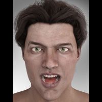
Leo comes with the full complement of effects maps that one would expect: normal, bump, translucency and specular. The bump maps are nothing special; they are passable in most regards, with some unique attention paid to the eyebrows, which is good (can't stand black eyebrows on a bump map!). The specular maps are interesting. They continue with the trend towards extremely dark (darker even than Michael 7 it seems) but they have a significant distribution of noise. I associate this technique with the artist Jepe, he's done this for years. The noise isn't quite as thick as I remember Jepe using, but it certainly works to good effect: breaking up the specular effects and adding to the apearance of the skin, making it rougher, porous. You can see the effect in the images above of both Leo and Michael.
The normal maps, like Michael's, are exquisite. The additional detail that they bring is truly amazing. The normal maps detail veins, elbows and knees, even fingers and toes. What's more, the veins line up with the HD morphs and the translucency maps. The attention to detail is impressive. And on the subject of the translucency maps: they are what we have come to expect from Genesis 3 line: pale, detailed, with added blood vessels. They seem to work well... I'm not 100% sure about them (why does Karen 7 have bloody red translucent maps for her face? I haven't seen another model yet that does) and I'm not convinced yet that the added blood vessels contribute much to the overall effect.

